

Design
Design system
Everything on this site reduces to two colours, two typefaces, and a handful of numbers, repeated everywhere rather than improvised. This page renders them live, from the same values the code uses — not retyped from the written specification.
Colour
Two colours, not three. Carbon and White swap roles with the theme — ink is text and lines, ground is the background — so nothing is ever hard-coded to one or the other.
#0D0F12
#FFFFFF
ink / ground — Text, lines and marks. White in dark mode, Carbon in light mode. The background. Carbon in dark mode, White in light mode.
The written specification also names a third colour, Blueprint blue, as a secondary accent. Nothing on this site currently uses it — what's shown here is what actually ships.
The opacity ladder
Every tone below full ink is one of the two colours at reduced opacity, never a separate grey.
- Primary text100%
- Secondary text72%
- Disabled / faint45%
- Hairline15%
- Fill8%
The one exception: political groups
The Parliament's seating chart uses colour to carry meaning, because red on the left, yellow in the centre, blue on the right is a convention readers already know. It's the only place hue is used for anything.
- The Left
- S&D
- Verts/ALE
- Renew
- PPE
- ECR
- PfE
- ESN
- NI
Reference blues
Three blues for work outside this site — slides, print, social posts — where a European blue is wanted. #003399 is the blue of the European flag. None of them is used in this interface, which stays two colours. The figure on each swatch is its contrast with white text.
- Aa6.2:1
- HEX
- #006796
- RGB
- 0, 103, 150
- Carbon
- 3.1:1
- Aa10.9:1
- HEX
- #003399
- RGB
- 0, 51, 153
- Carbon
- 1.8:1
- Aa8.6:1
- HEX
- #0000FF
- RGB
- 0, 0, 255
- Carbon
- 2.2:1
Typography
Two families. Inter is the drawing: labels, navigation, headings, anything that identifies or measures. Tinos is the reading: anything meant to hold attention for longer than a minute.
Inter is the drawing. Tinos is the reading.
Type scale
16px base, a 1.25 ratio (major third).
- Blueprint EuropeDisplay · 48px · 1.1 · 500 · −0.02em
- Blueprint EuropeH1 · 39px · 1.15 · 500 · −0.02em
- Blueprint EuropeH2 · 31px · 1.2 · 500 · −0.01em
- Blueprint EuropeH3 · 25px · 1.3 · 500 · 0
- Blueprint EuropeH4 · 20px · 1.4 · 500 · 0
- Blueprint EuropeBody (interface) · 16px · 1.5 · 400 · 0
- Blueprint EuropeBody (reading) · 21px · 1.7 · 400 · 0
- Blueprint EuropeSmall · 14px · 1.5 · 400 · 0
- Blueprint EuropeAnnotation · 12px · 1.4 · 400 · +0.08em
The mark
A circle under construction. Twelve radial ticks, set every 30°, echo the twelve European stars without quoting them. The inner circle is the plan; the solid arc is the part already built.
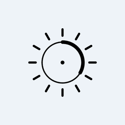

- Stored as a light and a dark PNG. CSS shows the one that matches the theme, the same way every theme-aware icon on this site works.
- Clear space: at least the radius of the inner circle on every side. Nothing enters it.
- Minimum size: 32px on screen.
Grid and spacing
An 8px base scale. Every gap, padding and margin on this site is one of these nine values.
- 4px
- 8px
- 12px
- 16px
- 24px
- 32px
- 48px
- 64px
- 96px
Corners
Small, consistent radii. No pills, and no rounded corners on a single-sided border.
- Controls, fields, buttons4px
- Cards and containers8px
- Solid fields and covers2px
Lines
Hairlines default to 0.5px. 1px and 2px read as heavy in this system.
Icons
Every icon on this site is drawn by hand as inline SVG, in the same stroke weight and colour as the text around it — no icon library, for the same reason as no component kit.
- Sun
- Moon
- Panel
- Avatar
- X
The one exception is other companies' own marks: Instagram and X in the footer come from simple-icons, an open-source library of official brand marks, because those aren't ours to redraw.
The full written specification is DESIGN.md, in this project's repository.